We provide lovingly crafted style variations to give you a glimpse of what is possible with this theme. The built-in theme customizer allows you to modify colors, fonts, sizes and much more without any CSS knowledge. Just choose your colors with the color picker and adjust the theme with only a few clicks. Click on one of the images to see the style.
Each style includes a unique background style or animation.
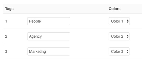
This Theme features the option to assign different colors to tags, highlighting the tagged content.
Go to the "Tags" section in the "Settings" panel and enter your tag in the field. You can choose from ten predefined colors.
For more information on how to use tags, take a look at the WordPress or Joomla documentation.

Tagged menu items of the main navigation automatically adapt the appropriate color and display a matching border below the navbar.


A number of different UI elements can be styled using tags in this theme. For example, you can add one of the .tm-tag-* classes to a container, like a panel, to modify badges. Or you can apply a different border color to each item of a tabbed navigation.
      	  <!-- Badge -->
          <div class="tm-tag-1">
              <div class="uk-badge">...</div>
          </div>

          <!-- Tabs -->
          <ul class="uk-tab" data-uk-tab>
              <li><a href="/"></a></li>
              <li class="tm-tag-2"><a href="/"></a></li>
          </ul>
Additionally, you can highlight headings or text elements in your tag color. Just add one of the .tm-tag-color-* classes.
<h1 class="tm-tag-color-1">...</h1>

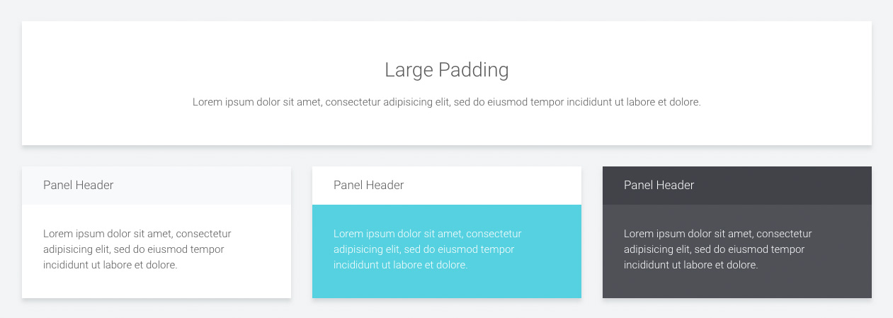
This theme comes with a number of additional panel styles. You can apply a different header, which can be combined with the different boxes and add some extra padding to the panel.

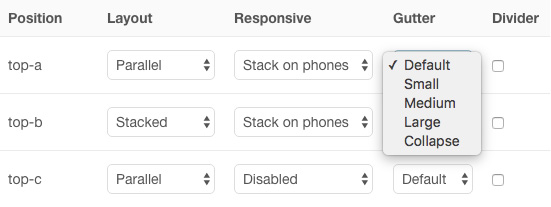
Monday theme allows you to apply a different gutter to each widget/module position or to remove the spacing altogether.

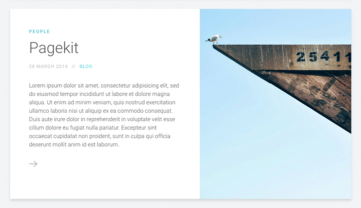
Monday theme features its own blog style that places the featured image and content side by side. Tags will also be colored according to the scheme set in the Warp administration.
You are able to choose from 2 different navigation layouts. One aligns the logo and menu to the left. The other one centers both in a stacked layout, which is ideal for big logos.


Another option allows you extend the main navigation dropdown to the width of the entire browser window.


Of course this theme provides the option to apply a sticky navigation. When scrolling the page it will remain at the top of the browser window.

| Class | Description |
|---|---|
.tm-text-uppercase |
This class will transform your text to capital letters. |
.tm-margin-xlarge,.tm-margin-xlarge-top,
|
Add 50px top and/or bottom margin to elements. |
Video: 1736 by Christiaan Welzel, License: CC BY 3.0